lecture three
agenda
- adding images to your pages
- URLs and your directories
- cascading style sheets structure
- how do style sheets work?
- applying style sheets to web pages
- readings
image references
- images are inline elements
-
<img>- image element, also an empty tag - usage:
<img src="/images/widget_logo.gif"> - one of the most essential (and attribute-heavy!) tags
- primary attributes:
- source of image (
src):
e.g.,<img src="images/widget_logo.gif"> - dimensions (
width,height) in pixels:
e.g.,<img src="images/widget_logo.gif" width="574" height="99"> - alternate display (
alt):
e.g.,<img src="images/widget_logo.gif" width="574" height="99" alt="widget logo">
- source of image (
- why do we need to be specific?
- the more you can tell the browser about the structure of the document, the faster it will be served up to the user - and speed is crucial to this medium
- other (old school) attributes:
- border width (
border):
e.g.,<img src="images/widget_logo.gif" width="574" height="99" alt="widget logo" border="2"> - text alignment (
top,bottom,middle) - refers to text alignment in relation to image - image alignment (
left,right) - refers to image position on page:
e.g.,<img src="images/widget_logo.gif" width="574" height="99" alt="widget logo" border="2" align="left"> - spacing (
hspace,vspace):
e.g.,<img src="images/widget_logo.gif" width="574" height="99" alt="widget logo" border="2" align="left" hspace="10" vspace="10">
- border width (
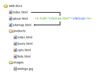
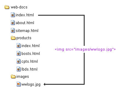
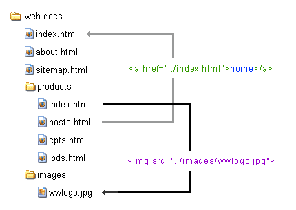
URLs and your directories
exercise one
Use the notes above (and your textbook) to add images to your WidgetWerks pages from last week. Download the week03 folder from the shared FTP space. The starting files are in the folder called ex01_images.
- On every page, add the WidgetWerks logo to the top of the page. Make it a link back to the home page.
- On each page, somewhere near the top of the content, add in a reference to the image with the same name, e.g., partners.jpg goes with partners.html. Add home.jpg to your index.html file. Be sure to include the width, height and alt attributes for each image.
- Using the button images in the /images folder, create a horizontal navigation bar across the top of each page that links to each of the other pages in the site.
introduction to cascading style sheets
- HTML is a structural language: pages are coded according to their logical structure - nothing to do with presentation
- style refers to the set of attributes applied to individual elements - essentially the elements of presentation:
- section head = bold, Verdana, green, 14 point
- if you define a style called "sectionhead" you can apply that style to all section titles in a document or a site using the label "sectionhead" (it's not really called a label...more on that later)
- if you suddenly decide that you want all the section titles to be blue, you change the style definition, not the individual structural tags
how do style sheets work?
- cascading style sheets don't require any fancy software or plug-ins - just rules
- a CSS rule defines what the HTML should look like and how it should behave in the browser window
- three parts to a CSS rule:
- selector
- property
- value
- selector {property: value;} = rule
- selector - can be HTML, class or ID (see below)
- {property: value;} = declaration
- properties identify what is being defined: font-family, font-weight, font-size, color, etc.
- values are assigned to define the nature of the property: verdana, bold, 16pt, green, etc.
- three base types of CSS rules, as determined by their selector:
- HTML selector - the HTML selector (P, H3, etc.) is used to redefine how the tag displays:
p {font: bold 16pt verdana;} - Class - a "free agent" rule that can be applied to any tag at your discretion:
.introhead {font: bold 48pt verdana;} - ID - work like class selectors, but usually apply to only one element on the page:
#mainnav {position: absolute; margin-top: 20px;}
- HTML selector - the HTML selector (P, H3, etc.) is used to redefine how the tag displays:
- three places to define rules:
- in an external document that is then linked or imported into your HTML page(s); called an external rule
- in the head of a document to affect an entire web page; called an embedded rule
- in an HTML tag: in the body of the document to affect one tag only; this is called an inline rule
- this is the cascading part of CSS as you could, in fact, use inline, embedded and external rules together: an inline rule will override an embedded rule, which will override an external rule
applying style sheets to web pages
- to set the style for an indivdual HTML tag (i.e., an inline rule), we use the following syntax:
<h1 style="color: red;">content</h1> - in this way we're gaining more control over the display because there's more things we can do with each tag
- the main use for CSS is to set the styles for an entire document, which is done by adding the following to your HEAD section:
			<style type="text/css">

			   h1 {color: red;}

</style> - in effect, isn't much different from adding style to an individual tag; except that you can manage style for ALL H1 tags in document from ONE PLACE
- the major benefit of CSS is the external file: allows you to define all your styles for a site in one document, and link it to all pages
- changes to a style can be made once and affect all instances of the style throughout a site
- setting up an external CSS file is a two step process:
- first, set up the rules in a separate text document and save it with a .css extension
- then, link the document to each page using the <link> tag:
				<head>

				   <title>document</title>

				   <link rel="stylesheet" href="filename.css">

				</head>
- rel="stylesheet" defines the link to a stylesheet
- href="filename.css" is the URL for the external file
css for images
Based on the "old school" image attributes above, here's how you'd use CSS rules instead:
- border (
border-width, border-style, border-color):
- shortcut:
img {border: 1px solid black;} - can also use:
border-top, border-top-width, border-top-styleetc.
- shortcut:
- image alignment (
float):
-
img {float: right;}orimg {float: left;} - centred:
img {display:block ; margin:0 auto ;}
-
- spacing (
padding):
-
img {padding: 10px 5px 40px 34px;}(top, right, bottom, left) - can also use:
padding-top, padding-bottom, padding-right, padding-leftetc.
-
- margin (
margin):
-
img {margin: 10opx 15px 0 30px;}(top, right, bottom, left) - can also use:
margin-top, margin-bottom, margin-right, margin-leftetc.
-
exercise two
Objective:
Reformat the WidgetWerks navigation system, links and font styles using CSS.
Your instructor will walk you the creation of CSS rules to reformat the WidgetWerks pages.
The starting files for this exercise are in the folder called ex02_site_styles.
checking your work:
- You can check your CSS in the same way that you can check your HTML:
- Check your work using a validator:
W3 CSS Validation Service - Will help you find missing semi-colons, typos and invalid property/value pairings.
Assignment One: Due next week
Create a small website for your account on bcitwebdev.com with at least three (3) linked pages. Suggested structures might be:
|
Home (About Me) Pets Family | OR |
Home (About Me) Education Work Experience | OR |
Home (About Me) Bad Trips Enemies |
etc...
Your pages should include the following elements:
- An example of lists.
- A link to your email address.
- Coloured backgrounds and/or text (using CSS).
- An image (of you, or your cat, or whatever).
- Links to outside resources.
Upload your pages to your account on bcitwebdev.com and send the URL to your instructor.
assigned: session 1
due: session 4
worth: 10%